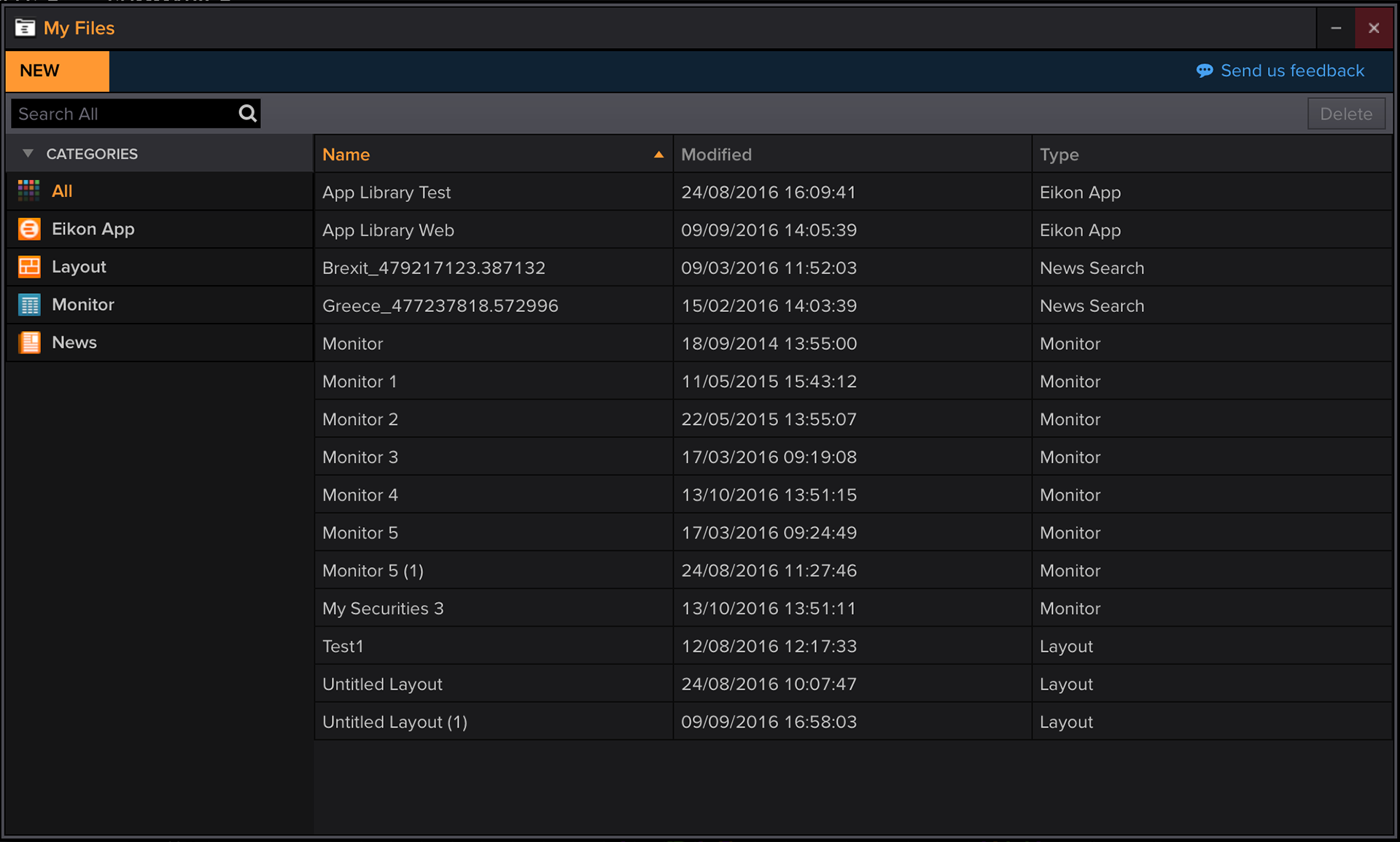
My files: One Place for all the Eikon Files
Task: Create a centralised place for all Eikon files from scratch
Team: UX, Visual Designer, Research Team, Development Team, Product owner, Project manager
My involvement: UX design, usability research, workshop facilitation, and stakeholder management
The Brief
The Eikon Platform offers a great number of apps, clients use on a daily basis. The users can save states of these apps, but there was no centralised place for these items to be organised. Moreover, some users were saving items to favourites, a place not meant for file organisation.
The product of this project ensures all the saved items can be found, grouped, organised, filtered, and shared in an quick and easy manner.
Problem Definition
I wanted to ensure I'm designing a solution to a concrete problem, and for this reason I reached out to the customer specialists team, who work closely with the end users to gather their opinions and insight.
Next, I organised, and with the help of the research team conducted, end user interviews to look deeper into their saving, retrieving, and organising habits.
After the collection of the data, I started sketching initial ideas on paper.
Personas
A few personas came up from the research conducted during the problem definition.
- Customers who would save the states of the apps to share with their team
- Customers who would set up one or more applications and save the states for induction purposes of the new hires
- Customers who would share multiple versions of the same app, depending on there trading activity
- Templates where often confused as saved states, so the design needed to accommodate for them as well
My team and I assigned a name, and the type of activity the persona would engage with (e.g. trader), the type and size of screen they would use (e.g. single - multiple monitor setup), and frequency of saving activity. The wireframes and their iterations ensured they stayed true to the personas needs and requirements.
Wireframes
Having gone through numerous iterations, the first set of wireframes was produced. They were broken down into areas (image below) and would be developed in the same way. Each area was further analysed with its interactions broken down to the component level.
Supporting Development
Once the initial, signed off set of wireframes was complete, the development started. Frequent catchups ensured the agreed wireframes, interactions, and animation would be closely followed and that the produced result was as designed.
Usability Testing
With the invaluable help of the research team, we validated the designs we felt confident that met the user's requirements.
I created an interactive prototype in Axure, to test functionality that can't be easily described (like dragging to group, or multi-select) and used the static wireframes for the high level concept.
We took the users' feedback into account and iterated accordingly.
Visual Design
Eikon has a predefined library of visual design elements, fonts guidelines, and colour palette, all of which were used to replace my grayscale wireframes.
Where are my Nested folders?
One of the outcomes of the research study was that some of our users created nested folders, many levels deep. We run analytics and realised that only a very minor percentage of the users were nesting folders. A closer looks at the data suggested that from this group, only a handful were nesting folders over two levels deep. To simplify the application's design and meet our release target we opted for a two level folder structure. Mindful of the small number of users that had more than two, we created an automatic migration mechanisms to flatten the multiple nested structure in a meaningful and helpful way. We kept the name of the folder at a higher level and rename the rest using that name as the prefix. Early testing showed that this method allayed any concerns for the target audience.

